
HS 효성은 효성그룹에서 독립해 출범한 신규 그룹으로,첨단 소재·기술·지속가능성을 중심으로 미래 산업을 이끄는 글로벌 기업입니다. 과학과 기술, 집단지성을 바탕으로 새로운 가치를 창출하며 인류의 삶을 더 풍요롭게 하는 것을 목표로 합니다. HS 효성의 로고는 ‘별(Star)’과 ‘나무(Tree)’의 의미를 결합한 CI ‘MASTERIA’를 기반으로, 세상을 이끄는 방향성과 혁신을 상징하는 별처럼 미래를 비추고, 깊은 뿌리로 지속적인 성장을 이어가는 나무처럼 사회에 가치를 키워가는 기업이 되겠다는 비전을 담고 있습니다.
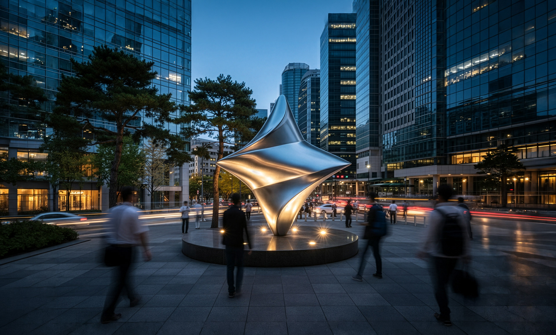
브로앤시스는 브랜드 이해를 위한 케이스 스터디를 바탕으로, HS 효성 로고에 담긴 별과 나무의 의미를 디자인 가이드에 맞게 3D로 재해석하고 모션그래픽으로 구현했습니다.
HS Hyosung is a newly established group spun off from the Hyosung Group,leading future industries through advanced materials, technology, and sustainability. Grounded in science, innovation, and collective intelligence, we create new value and aim to enrich the lives of people around the world. The HS Hyosung logo is based on its CI, “MASTERIA,” which combines the symbolism of a star and a tree—representing a vision to lead the future like a guiding star, while continuously growing and creating value for society like a deeply rooted tree.
Based on an in-depth case study to understand the brand, Bro&Sis reinterpreted the symbolic meanings of the star and the tree in the HS Hyosung logo in 3D, in line with the design guidelines, and brought them to life through motion animation.
Edited into a seamless looping version of the logo animation
Styleframe


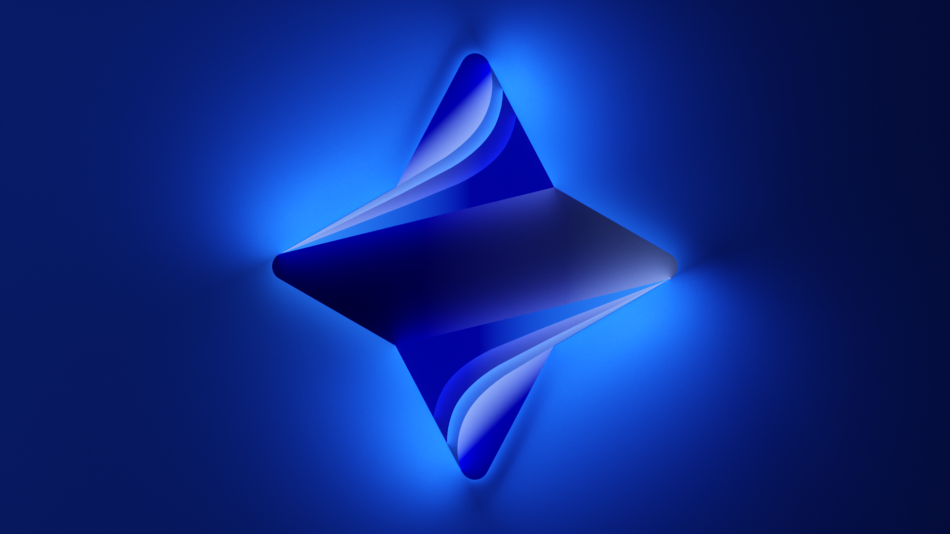
효성 로고를 3D로 구현하기 위해 형태가 지닌 조형적 동일성, 패턴 구조, 그리고 단순화 가능성을 종합적으로 고려하여 디자인을 개발했습니다.
입체화 과정에서도 구조적 일관성을 유지하면서 다양한 확장에 유연하게 대응할 수 있도록 설계했으며, 동시에 별의 명확한 형상과 나무가 지닌 자유로운 곡선의 흐름을 함께 내포하도록 조형을 정립했습니다.
To realize the Hyosung logo in 3D, the design was developed with careful consideration of its formal consistency, pattern structure, and potential for simplification.
Throughout the dimensional transformation process, structural coherence was maintained to ensure adaptability across various extensions, while preserving both the clarity of the star’s geometry and the organic, flowing curves derived from the identity of the tree.
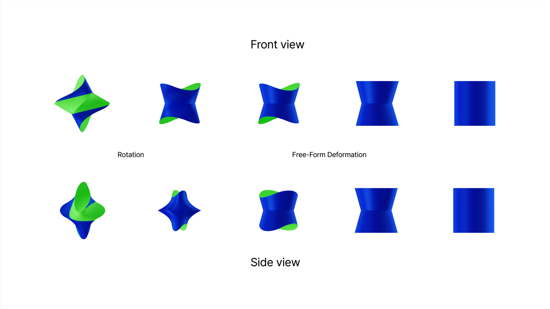
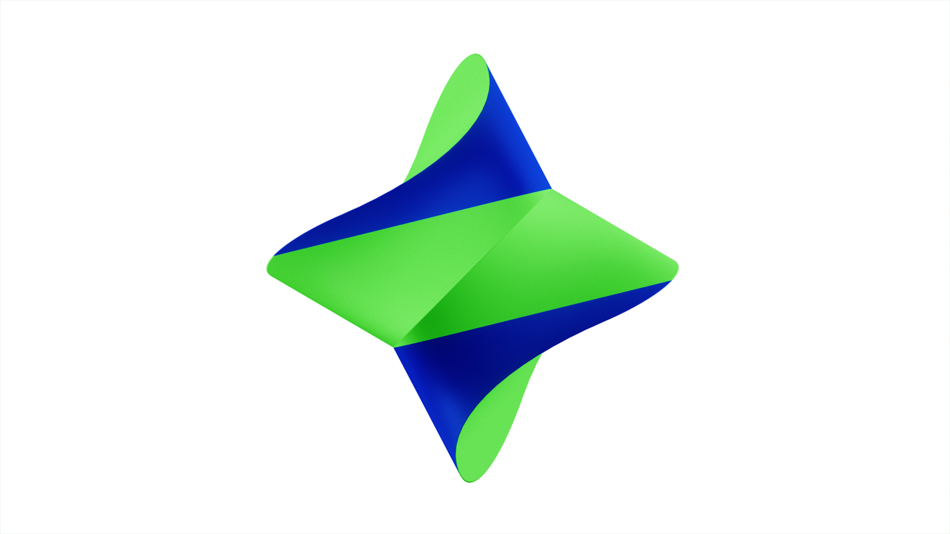
케이스 스터디를 기반으로 디자인 계발 과정을 진행하여 HS 효성 CI에 담긴 나무와 별의 의미를 분석하고, 이를 토대로 로고를 3D로 재해석해 시각적으로 확장했습니다. 나무의 아이덴티티인 나이테(Rings)를 구조적 모티프로 적용하고, 별의 아이덴티티인 위성과 별자리(Orbit & Constellation)를 그래픽 언어로 접목하여, 로고의 조형적 특성을 입체적 구조와 모션 시스템 안에서 구현했습니다.
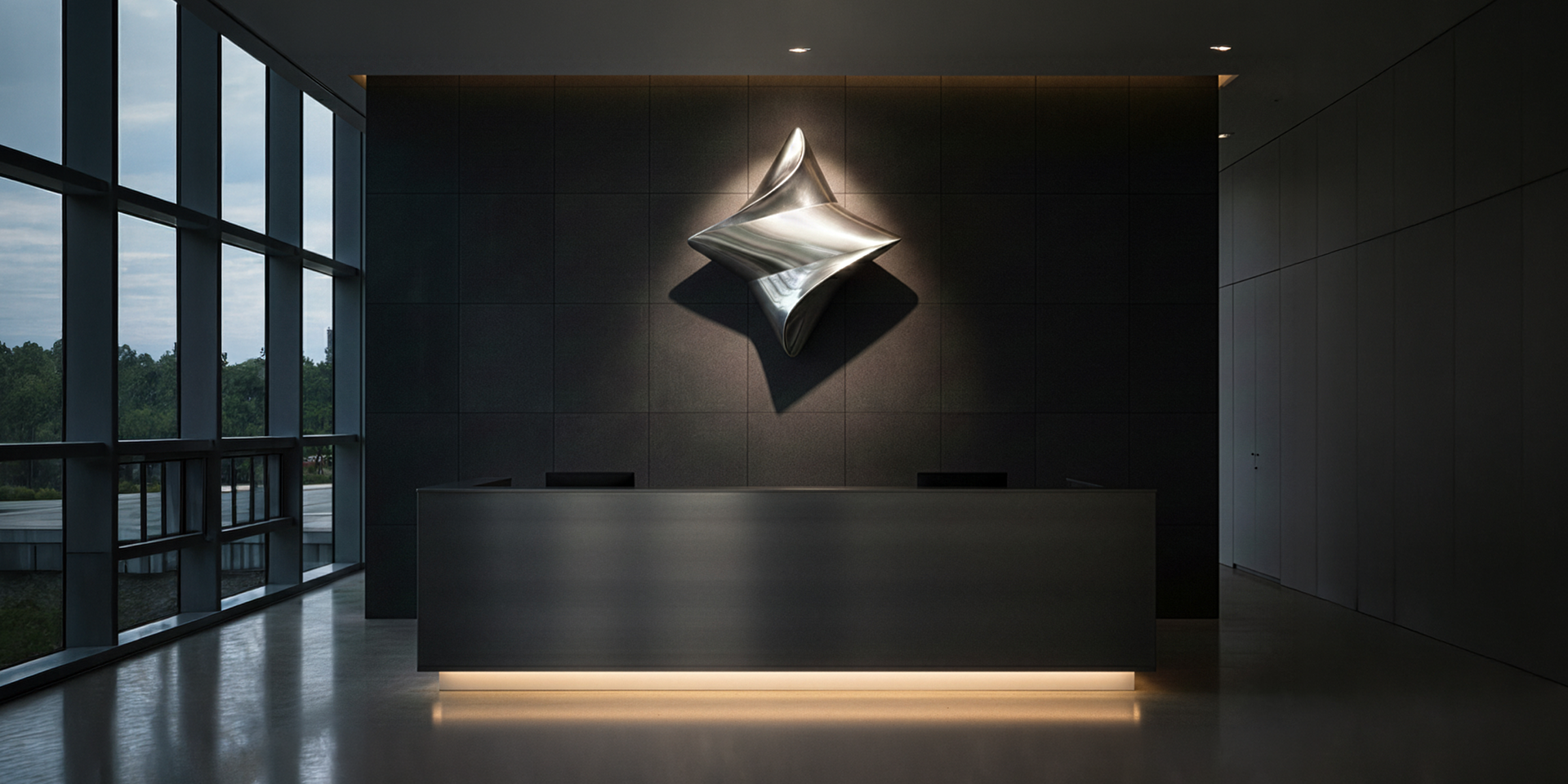
형태의 특성과 확장을 중심으로 전개된 모션을 통해 브랜드의 역동성과 미래지향적 이미지를 강화했습니다.
Based on a case study, the design development process was carried out by analyzing the meanings of the tree and star embedded in the HS Hyosung CI, and reinterpreting the logo in 3D to visually expand its identity. The tree’s identity, represented by growth rings, was translated into a structural motif, while the star’s identity—satellites and constellations—was integrated as graphic language, establishing the logo’s formal characteristics within a three-dimensional structure and motion system.
The motion, developed around the inherent qualities and expansion of the form, reinforces the brand’s dynamism and forward-looking image.
Credits
Design Agency / Logo Design — Lippincott
Animation Studio — Bro&Sis (브로앤시스)
Design Agency / Logo Design — Lippincott
Animation Studio — Bro&Sis (브로앤시스)